Measuring Competing KPI’s in Power BI
This visual in Power BI allows me to test myself against not one, but two KPI's at the same time. It provides me with a percentage score and a visual representation of how often I hit those two targets.
What makes this visual particularly interesting to me is that these are competing metrics - the faster I run, the higher my heart rate will go.
The points on the chart each represent individual 250 metre splits from a single run. They are green when I achieve both targets, and red otherwise.
The percentage represents how often I hit both targets in a single split.
I can change each of these targets using the parameter slicers, and this updates both the colour of the points, and the percentage.
You can probably think of two metrics from your field where improving one often has a detrimental effect on the other. Here’s a few examples:
E-commerce => Delivery Days vs Delivery Cost
Manufacturing => Time per widget vs Defect Rate
Retail / Wholesale => Units Sold vs Margin %
Where Did This Come From
Ok, so for a bit of oversimplified context.
I'm training for long-distance running. However, I don't have the time (or the spare knees) to always go for super long runs.
By aiming for a lower heart-rate even on shorter runs, I am training my body to run in the way I would be on longer runs.
But, I still want to run as fast as practical at that lower heart rate.
And there is the conflict.
How It's Built
I'll work through how I created this visual specifically, using my existing data model in Power BI. If you are doing something similar, there may be some additional aspects and steps you'd need to take into account.
This visual requires:
split level running data with heart rate and seconds fields
a model relationship between the split data and some activity details
two What-if parameters for target setting
a DAX measure for the joint KPI
Note: If you have a joint target percentage in mind, you could use conditional formatting to make the chart and the KPI change colour based on whether you hit it.
The Data
Run Splits
The data that I get from my smartwatch provides 250m splits that include, amongst other things, my average heart rate and the number of seconds taken.
This image shows a snapshot of this data, reduced to the relevant columns.
Run Activities
This table is only needed to add the date to enable simpler filtering to the run I am looking for.
The Relationship
Here’s the relationship to enable splits to be filtered by the Activity Date.
What-If Parameters
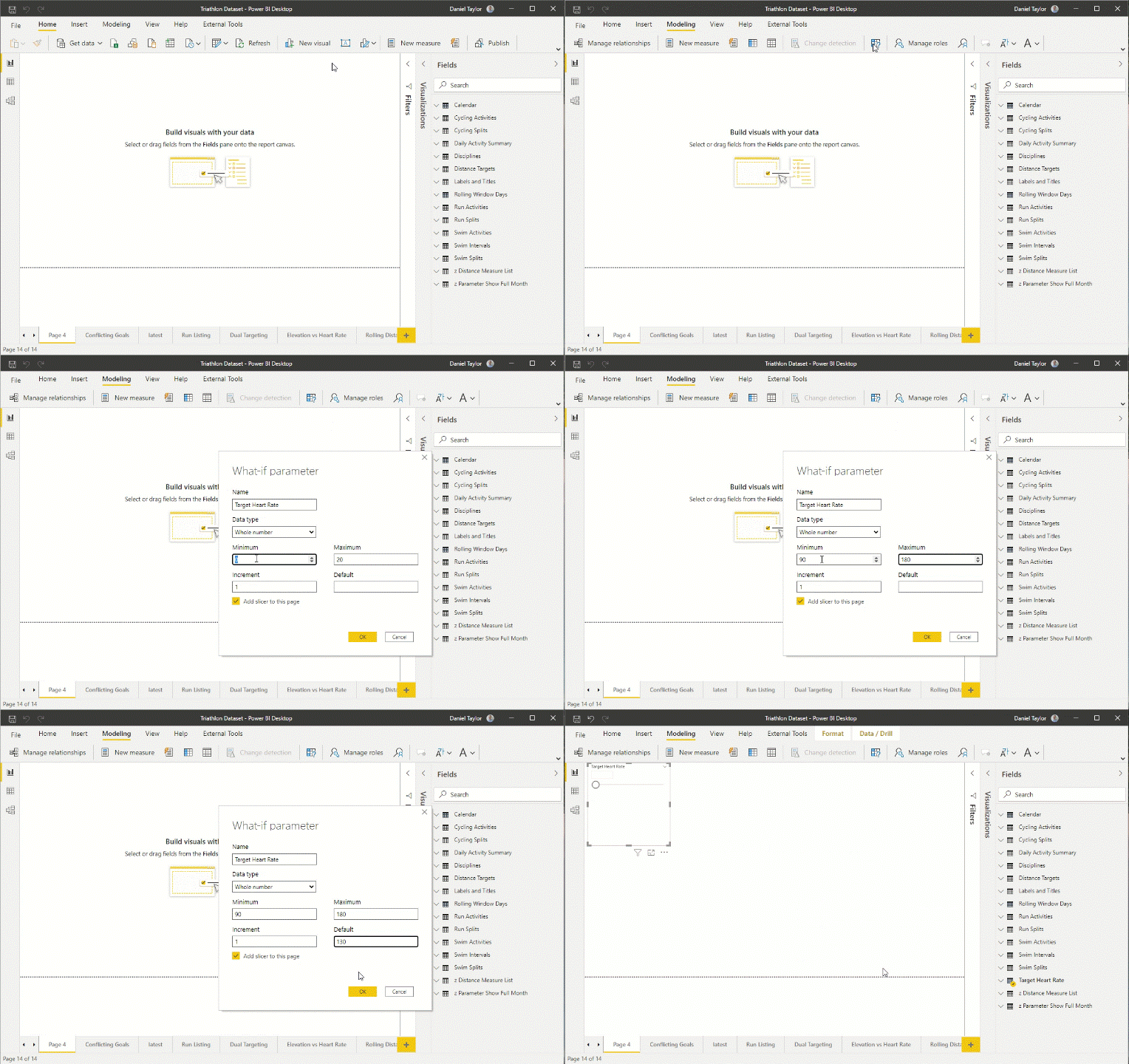
The two What-If parameters are where I set the dual targets for the visual.
Here is how I created one of these.
DAX Measure - Joint KPI Percentage
This DAX measure calculates the percentage of splits which hit both targets at the same time.
It does this by making two counts of splits - one which is filtered to the green dots, and one which is unfiltered.
It then returns the first as a percentage of the second.
This measure displays the percentage in the card and supports the conditional formatting of the scatterplot.
THE VISUALS
Two visuals make up this view -the scatterplot showing the splits, and the card showing the percentage.
Visual I: The Scatterplot
Fields
The scatter plot uses the split Seconds field on the y-axis and the split Heart Rate field on the x-axis.
It uses a universally unique Split Id as the detail field.
Conditional Formatting
To get the green vs red dots effect, I've applied conditional formatting to the chart's Data colors element.
The Joint KPI measure outlined above takes the value of 100% or 0% for each split.
It is only when these are averaged over larger groups that different values come up.
As such, we can use this same measure as the binary rule field when specifying each dot's colour.
Visual II: The Card
Nothing fancy here - this is just a card with our joint KPI measure added to the values field.
In Closing
This article demonstrated a visual that represents competing goals visually and allows you to test these at different levels.
By bringing two competing goals together, we can balance priorities, and track improvements with some all-important context.
I'd love to hear your feedback on this visual, as well as ideas you have for how you could use something similar.
You can contact me directly at daniel@groundflooranalytics.com.au, or else you can join the conversation and comment over on the LinkedIn post where this was shared.


