A Colourful, Quantitative, Goal Tracker in Power BI
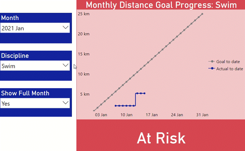
This visual in Power BI allows me to see how I’m tracking against my training volume goals across the three triathlon disciplines.
That grey line is how many kilometres I should have done by that day, and the blue line is how many I’d actually done.
The colour of the chart and the status indicator at the bottom change depending on where I’m at:
If I’m ahead of schedule, I’m “On Track” and it goes green 🟢
If I’m a bit behind, I’m “A Bit Behind”, and it goes orange 🟠
If I’m well behind, I’m “At Risk” on that goal, and it goes red 🔴
I use this to help me decide on my workouts for the week, and to keep my training in balance.
Seeing that line tick up after I upload another workout is also just a great motivator to simply get me out the door.
Not only that - it also kind of reminds me of watching cricket over the summer growing up, seeing how the batting team was progressing compared to their opposition’s innings.
Where Did This Come From?
Ok, so for a bit of context, at the end of last year, I decided to put a bit more structure around my training for 2021.
I figured that a good, basic way to get started would be to set some monthly distance goals for each discipline.
But when it was around the 8th of this month, and I wanted to know whether I was on track, I had to pull up a spreadsheet to run the numbers.
Knowing that this was something I’d like to know quite frequently, I created this visual to do the job.
Now, whenever I add a new workout, I can see how it impacts my progress towards that month’s goals.
So, while this has been really useful for my training, you can probably see that you could use a visual like this for any other goal where you have a number in mind that you’d like to hit, or stay below for that matter.
A couple of examples could be revenue, new users, or new followers acquired on your social media accounts.
How It’s Built
I’ll work through I created this visual specifically, using my existing data model in Power BI. If you are doing something similar, there may be some additional aspects you’d need to take into account.
This visual requires:
distance data with a date and discipline attached
monthly targets by discipline
a basic set of relationships
several DAX measures
some conditional formatting on several elements.
The Data
Distance data

The data that I get out of my smart watch is different by discipline.
To simplify this build I created a combined table that gives me the date, discipline, and number of kilometres covered.
This image shows a snapshot of this data.
Target data
I also needed some target data to compare this too. These targets are the total number of kilometres I intend to hit for the month.
Below is this data set filtered to the month of January 2021.

BaSic Set of Relationships
To enable these two sets of data to be combined into single measures, and to allow filtering of both by Discipline and Date at the same time, the following relationships were required.

DAX Measures
There are five DAX measures used directly in this visual.
Some of these are quite lengthy, and it may not be clear to all what is going on. The comments in the code are intended to make them simpler to follow along with.
[A] Month to Date Distance Goal
This figures out what proportion of the month has passed, and then multiplies this by the total goal for the month.
It is the grey line in the chart.

[B] Month to Date Cumulative Distance
This sums up the total distance covered for the discipline by the given day of the month.
It is the blue line in the chart.

[C] Current Variance from Target
This gets the difference between [A] and [B], and calculates this as a proportion of the total distance goal.
This is used to set the value of the status label, and in setting the colours of the elements.

[D] Status of Monthly Goal
This is dependent on [C].
If I am ahead of my goal (C is less than or equal to 0), then it returns “On Track”
If C is between 0 and 0.1*, then it returns “A bit behind”
If C is greater than or equal to 0.1*, it returns “At Risk”
*0.1 represents a shortfall of more than 10% of the total goal for the month.

[E] Monthly Distance Goal Progress Title
This just allows me to change the title of the chart dependent on which discipline is chosen.

The Visual(s)
This visual is actually a combination of two visuals (not counting the slicers).
The first is a line chart, which is everything except the call out at the bottom. That call out is a card.

Part I: Line Chart
The line chart has the Date field from my Calendar table on the bottom axis, and it shows the goal and actual distances (measures A and B above) across the month.
It also uses Monthly Distance Goal Progress Title (measure E above) for the title.
Conditional Formatting
I then applied conditional formatting to the background, border, and title background.
Note that some transparency is added to this for the main background.
The rules are based on the Current Variance from Target (measure C above), and match the conditions of the Status Label.

Part II: Card
The card underneath the line chart is our status label, and simply takes on the value of Status of Monthly Goal (measure D above).
The same conditional formatting rules are applied to this card as are applied to the various pieces of the line chart.
In Closing
This was a demonstration of a visual that represents linear progress being made towards a monthly goal.
Seeing data represented like this can help to provide a quicker, more visceral idea of where you stand against where you intended to.
I’d love to hear your feedback on this visual, as well as ideas you have for how you could use something similar.
You can get in touch with me directly at daniel@groundflooranalytics.com.au, or else you can join the conversation and comment over on the LinkedIn post where this was shared.